NEW YORK KNICKS “EMPIRE STATE” JERSEY CONCEPT
The Empire City concept jersey makes use of the “Subway Token Logo” secondary which debuted in 1996 and was designed by one of my favorite designers, Michael Doret.
The letters “NYK” represent the city and the team’s nickname New York Knicks. Michael's design drew its inspiration from the old MTA subway tokens and elements of it crept into early concepts of the Knicks’ primary logo. The Knicks have been using as a secondary logo since 1995. It's graced equipment and merchandise since then, and was featured on the back of the uniform until recently. Michael's design drew its inspiration from the old MTA subway tokens and elements of it crept into early concepts of the Knicks’ primary logo.
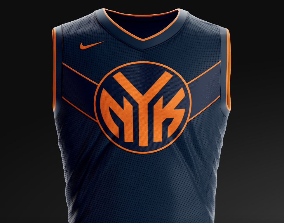
The lines across the chest extend to the sleeve holes to mimic the angles one would experience standing on a street corner in New York.

The belt buckle graphic proudly features the NYC initials.

A nod to New York’s famous nickname is printed above the jersey's jock tag.
The shorts feature a cascading design inspired by the ceiling at Madison Square Garden, the iconic building in which the Knicks have played basketball along with the initials MSG at the center.


I’ve got a few more NBA jersey concepts cooking that I will post in the next couple of weeks. Including the second version of the Knicks Empire design.
HELP ME DO MORE DOPE STUFF…..PLEASE SHARE!
http://www.1managency.com/gcasedesignblog
MY SOCIAL:
http://www.instagram.com/gcasedesign/